Migrating to Variables in Figma

Welcome to my diary entry on migrating variables to Figma! This process is on-going and this article will be updated as more information, learnings, and developments occur.
In June 2023 Figma announced a new feature during their annual CONFIG conference. Variables. Watching the demo was deeply exciting to me as a design nerd, and I immediately wanted to upgrade the design system at my current company to take advantage of them.
I’ve included a few different things in this diary entry:
Diagrams and learnings on setting up variables in Figma for a Design System
Some example components / elements in the updated system that now use variables
Resources and talks used to understand variables better
Setting up variables in Figma
I started with colors! I set up a few collections to start.
colors-primitive: the “primary-10” et. al. collections
colors-semantic: the material designations from the existing system, like “on-accent-container.” The semantic layer is also where I built in accessibility modes like light/dark mode (all my styles are built to comply to high contrast and color-blind modes implicitly, so they don’t need their own modes)
colors-component: most colors are covered by the semantic variables, so these will be filled out as very specific use cases continue to arise (typically for accessibility reasons in high-volume color situations, like graphs with lots of different types of data)

A variable collection in Figma called colors primitive. It has sections for several color types: primary, secondary, accent, error, info, success, warning, and neutrals, as well as white, black, and transparent.
Example components / elements
The example I’m using here is a button. Button variants in components get super complicated quickly. In this example, I went from 24 component variants to 8.
First, I made a variable collection called button-size
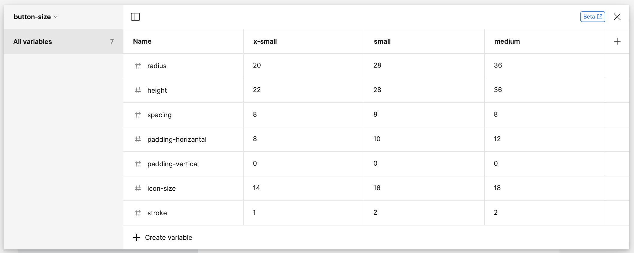
A variable collection in Figma. Three modes are shown: Extra-small, Small, and Medium. Each mode has 7 variables: radius, height, spacing, horizantal padding, vertical padding, icon size, and stroke width. Variables are numbers that increase as the mode size gets larger. For example, extra-small buttons have a height of 22 and medium buttons have a height of 36.

Second, I created the button component and linked the vales into the sizing and autolayout.
At the time of this writing, typography is not supported for using variables. When it is, however, I plan to have additiona variables to cover type: text-size and text-weight. I also plan to adjust the variables that control the size of the button so that heights are set to hug and then defined by text-dependent variables as REM is changed based on accessibility settings.
I only needed to make a “Primary” and “Secondary” color set. With variations in the component for the buttons states. I’ll likely make a section on text-based later.
While most of the buttons do not include strokes, I decided to include them as a number variable and as color variable so that they could be easily changed. A future version of the system might left-turn and end up where they all have thick, colorful strokes — and I felt that it might be faster to update and iterate as variables rather than editing the component as independent values for each.


Resources
Have you ever had the thought / feeling of “oh gosh, I wish I knew that earlier! I’ve wasted so many hours doing it the hard way!” I have. A lot. And while I knew I would feel it again trying out variables, I wanted to have an at least halfway decent understanding of them before jumping into the work. So while this is at the end of this article, it was actually the first thing I did.
Joining in on Figma Office Hours
---
Jacob Lowry is a white cis neuro-diverse designer living and working in San Diego, CA. He has over a decade of design experience working in consulting, in-house, and agency environments.
Featured Photo by Lenstravelier on Unsplash